スマホサイトでLINE風の幅可変ページを作成する
みなさんおはようございます。珍しく朝更新してみました!最近ブログのアクセス数が増えてきてモチベーションが上がってます(*⊃ω`*)
今日はスマホサイト制作のお話をしたいと思いますー。以前、お仕事でLINE風のLPページを制作したのですが、それが意外と難しかったので備忘録としてメモしておきます!
※本ページは広告・アフィリエイトプログラムにより収益を得ています。
目次
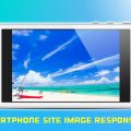
01.今回作るデザイン
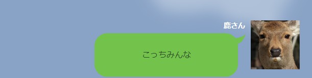
今回はこのようなページを作ります。
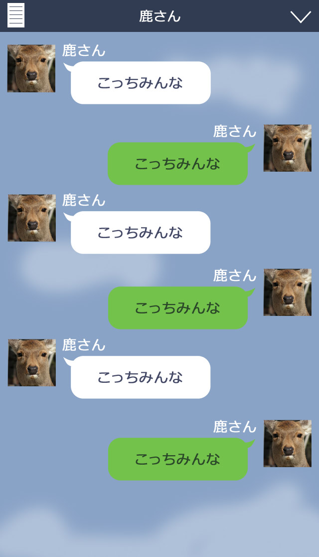
いかにもLINEを意識したページレイアウトになってますね…。実際のページは全然違う見た目ですが、吹き出しを使ったデザインになっています。
今回の仕様はこのような感じです。
- 1.HTML5・CSS3で作成
- 2.テキストはデバイスフォントで
- 3.画面を横にしてもレイアウト維持
Oh…。スマホサイトなのにPCサイトのLPページ並みにレイアウトがフリーダムになってます…。
吹き出し部分は中にデバイスフォントが入ってくるので、背景画像の縦横比率や位置を維持したまま可変しなくてはなりません。
02.実際にコーディングしてみる
それではコーティングしていくことにしましょう。画像を全てスライスし終わったところから始めていきます。
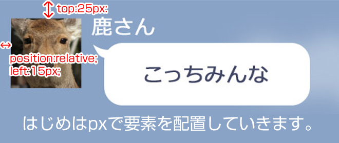
02-01.まずは普通にpx単位で配置する
まずはスライスしたPsdデータを元にpx数を測って画像を配置していきます。このときはPCサイトのLPページを作るように全てpx単位で配置しておきます。
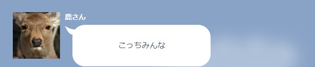
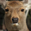
<div id="deer01" class="fuikidashWrap clearfix">
<p class="icon"><img src="img/deer.jpg" width="96" height="96" alt=""></p>
<section>
<h1>鹿さん</h1>
<div class="fukidashi">
<p>こっちみんな</p>
<!-- / .fukidashi --></div>
</section>
<!-- / #deer01 .fuikidashWrap clearfix --></div>
/* 吹き出し大枠 */
.fuikidashWrap {
	position:relative;
	top:25px;
	left:15px;
	width:402px;
}

/* アイコン */
.fuikidashWrap .icon {
	float:left;
	width:96px;
}

.fuikidashWrap section {
	float:right;
	width:296px;
}

/* 見出し */
.fuikidashWrap h1 {
	margin-bottom:10px;
	color: #fff;
	font-size: 88%;
}

/* 吹き出し */
.fuikidashWrap .fukidashi {
	position:relative;
	width:296px;
	height:86px;
	color: #434866;
	background: url(../img/fukidasi01.png) no-repeat left top;
}
.fuikidashWrap .fukidashi p {
	position: absolute;
	top: 50%;
	margin-top: -12px;
	width: 281px;
	text-align: center;
}
今回はposition:relative;で行いました。position:absolute;でも同様に行えますが、後の作業で不具合が出るため相対配置で行っております。
吹き出しは「.fukidashi」に背景画像として配置します。CSSで吹き出し画像の幅と高さを指定し、その中にあるデバイスフォントにも幅指定をして吹き出しからはみ出ないように調整します。
「.fukidashiWrap」の位置は奇数の時は左側に、偶数の時は右側に寄るので、CSS3のnth-childを使ってスタイルを振り分けます。このときに吹き出しの背景画像も一緒に変更しておきます。
奇数
/* 奇数(相手) */
.fuikidashWrap:nth-child(odd) {
	left:15px;
}

/* 奇数アイコン */
.fuikidashWrap:nth-child(odd) .icon {
	float:left;
}

.fuikidashWrap:nth-child(odd) section {
	float:right;

}

/* 奇数吹き出し */
.fuikidashWrap:nth-child(odd) .fukidashi {
	color:#434866;
	background:url(../img/fukidasi01.png) no-repeat left top;
}
偶数
/* 偶数(自分) */
.fuikidashWrap:nth-child(even) {
	left:216px;
}

/* 偶数アイコン */
.fuikidashWrap:nth-child(even) .icon {
	float:right;
}

.fuikidashWrap:nth-child(even) section {
	float:left;

}
.fuikidashWrap:nth-child(even) section h1 {
	text-align:right;

}

/* 偶数吹き出し */
.fuikidashWrap:nth-child(even) .fukidashi {
	color:#2b4829;
	background:url(../img/fukidasi02.png) no-repeat left top;
}
02-02.画像や要素の位置を%に変換する
先ほどpx単位で配置したものを%に変換していきます。
まずは横の位置を%にしていきたいと思います。
計算はこのように行います。
横のpx数÷親要素の幅×100
これを当てはめて計算すると…。
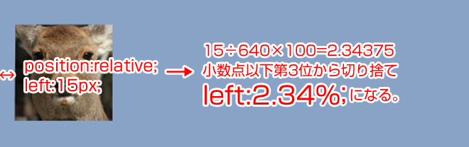
15px÷640px×100=2.34375%
このようになります。あまり細かく指定するとブラウザによっては解釈されないので小数点以下第3位からは切り捨てます。
縦の位置を計算するにはこのように行います。
縦のpx数÷親要素の幅×100
これを当てはめて計算すると…。
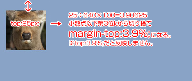
25÷640×100=3.90625
こうすることで縦方向の位置も計算することができます。このとき注意するのが、縦方向の余白をpositionで指定せずにmargin-topで指定することです。縦の余白で相対指定するときはmarginまたはpaddingでしか効きません。
02-03.背景画像の縦横比を%に変換する
次に吹き出しの背景画像を可変対応にします。
まずは横幅から計算していきます。計算式はこのようになります。
背景画像の幅÷親要素の幅×100
これを当てはめて計算すると…。
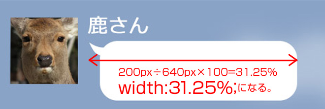
200÷640×100=31.25%
このようになります。
吹き出しの中のデバイスフォントの位置や幅も同様の方法で幅や位置を調整出来ます。
問題は高さの計算です。高さは基準のサイズが無いので、heightを指定しないと高さが0になってしまい画像が表示されません。かと言って絶対配置のままだと画像の縦横比がおかしくなって横幅が変わったときに途中で切れてしまいます。
そこで色々と調べたところ、以下の記事が参考になりました。まさに求めていたものです!
【CSS】デバイス幅に合わせたサイズ可変のメニューボタンをbackgroundで作る

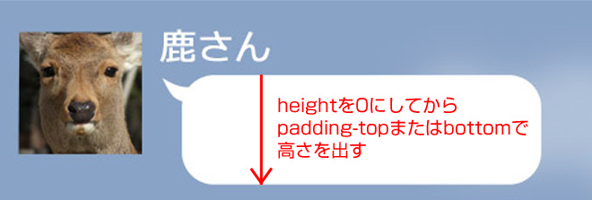
解決方法は、一度heightを0にしてpadding-topまたはpadding-bottomで高さを出すという目からウロコのような方法でした!
padding-topやbottomの計算はこのように行います。
画像の高さ÷親要素の幅×100
これを当てはめて計算すると…。
80÷640×100=12.5%
つまりpadding-topを12.5%に指定すると縦横比を維持したまま可変対応することができます。
この計算を吹き出しの数だけ繰り返していきます。とてつもなく面倒くさい作業です…orz
03.完成!
というわけで完成しました!デモページとサンプルデータを用意しております。
最終的なHTMLとCSSはこのようになっています。
<!DOCTYPE html>
<html>
<head>
<meta charset="UTF-8">
<title>スマホサイトでLINE風の幅可変ページデモ</title>
<meta name="viewport" content="width=device-width, initial-scale=1.0">
<link rel="stylesheet" href="css/style.css" >
</head>
<body>
<div id="all">

<header>
<p><img src="img/header.png" width="640" height="64" alt=""></p>
</header>

<div id="contents">

<div id="deer01" class="fuikidashWrap clearfix">
<p class="icon"><img src="img/deer.jpg" width="96" height="96" alt=""></p>
<section>
<h1>鹿さん</h1>
<div class="fukidashi">
<p>こっちみんな</p>
<!-- / .fukidashi --></div>
</section>
<!-- / #deer01 .fuikidashWrap clearfix --></div>

<div id="deer02" class="fuikidashWrap clearfix">
<p class="icon"><img src="img/deer.jpg" width="96" height="96" alt=""></p>
<section>
<h1>鹿さん</h1>
<div class="fukidashi">
<p>こっちみんな</p>
<!-- / .fukidashi --></div>
</section>
<!-- / #deer02 .fuikidashWrap clearfix --></div>

<div id="deer03" class="fuikidashWrap clearfix">
<p class="icon"><img src="img/deer.jpg" width="96" height="96" alt=""></p>
<section>
<h1>鹿さん</h1>
<div class="fukidashi">
<p>こっちみんな</p>
<!-- / .fukidashi --></div>
</section>
<!-- / #deer03 .fuikidashWrap clearfix --></div>

<div id="deer04" class="fuikidashWrap clearfix">
<p class="icon"><img src="img/deer.jpg" width="96" height="96" alt=""></p>
<section>
<h1>鹿さん</h1>
<div class="fukidashi">
<p>こっちみんな</p>
<!-- / .fukidashi --></div>
</section>
<!-- / #deer04 .fuikidashWrap clearfix --></div>

<div id="deer05" class="fuikidashWrap clearfix">
<p class="icon"><img src="img/deer.jpg" width="96" height="96" alt=""></p>
<section>
<h1>鹿さん</h1>
<div class="fukidashi">
<p>こっちみんな</p>
<!-- / .fukidashi --></div>
</section>
<!-- / #deer05 .fuikidashWrap clearfix --></div>

<div id="deer06" class="fuikidashWrap clearfix">
<p class="icon"><img src="img/deer.jpg" width="96" height="96" alt=""></p>
<section>
<h1>鹿さん</h1>
<div class="fukidashi">
<p>こっちみんな</p>
<!-- / .fukidashi --></div>
</section>
<!-- / #deer06 .fuikidashWrap clearfix --></div>
</div><!-- / #contents -->

<footer>
<p><img src="img/cloud03.gif " width="640" height="168" alt=""></p>
</footer>

<!-- / #all --></div>
</body>
</html>
@charset "UTF-8";

/* =====================
	CSSリセット
======================= */
* {
	margin:0;
	padding:0;
}

ul {
	list-style:none;
}

br {
	letter-spacing:0;
}

img {
	max-width:100%;
	height:auto;
	border:none;
	vertical-align:top;
}

/* clearfix */
.clearfix:after {
	content: ".";
	display: block;
	height: 0;
	font-size:0;
	clear: both;
	visibility:hidden;
}
.clearfix {
	display: inline-block;
}
/* Hides from IE Mac \*/
* html .clearfix {height: 1%;}
.clearfix{display:block;}
/* End Hack */

html,body {
	height:100%;
}

body {
	color:#333;
	background:#89a3c6;
	-webkit-text-size-adjust: 100%;
}

#all {
	max-width:640px;
	margin:0 auto;
}

/* =====================
	コンテンツ
======================= */
#contents {
	margin:0 auto;
	background:url(../img/cloud01.gif) no-repeat 100% 3.9%,
	  					url(../img/cloud02.gif) no-repeat 0% 53.25%;
	background-size:55.93%;
}

/* 吹き出し大枠 */
.fuikidashWrap {
	position:relative;
	width:62.81%;
}

/* アイコン */
.fuikidashWrap .icon {
	width:23.88%;
}

/* 吹き出し */
.fuikidashWrap section {
	width:73.63%;
}
.fuikidashWrap h1 {
	margin-bottom:1.56%;
	color:#fff;
	font-size:88%;
}
.fuikidashWrap .fukidashi {
	position:relative;
	height:0;
	padding-top:29.054%;
	background:url(../img/fukidasi01.png) no-repeat left top;
}
.fuikidashWrap .fukidashi p {
	position:absolute;
	top:50%;
	margin-top:-12px;
	width:95%;
	text-align:center;
}


/* 相手 */
.fuikidashWrap:nth-child(odd) .icon {
	float:left;
}
.fuikidashWrap:nth-child(odd) section {
	float:right;
}
.fuikidashWrap:nth-child(odd)  .fukidashi {
	color:#434866;
	background:url(../img/fukidasi01.png) no-repeat left top;
	background-size:contain;
}
.fuikidashWrap:nth-child(odd)  .fukidashi p {
	left:5%;
}

/* 自分 */
.fuikidashWrap:nth-child(even) .icon {
	float:right;
}
.fuikidashWrap:nth-child(even) section {
	float:left;
}
.fuikidashWrap:nth-child(even) h1 {
	text-align:right;
}
.fuikidashWrap:nth-child(even) .fukidashi {
	color:#2b4829;
	background:url(../img/fukidasi02.png) no-repeat left top;
	background-size:contain;
}

#deer01 {
	margin-top:3.9%;
	left:3.906%;
}
#deer02 {
	margin-top:6.25%;
	left:33.75%;
}
#deer03 {
	margin-top:6.25%;
	left:3.906%;
}
#deer04 {
	margin-top:6.25%;
	left:33.75%;
}
#deer05 {
	margin-top:6.25%;
	left:3.906%;
}
#deer06 {
	margin-top:6.25%;
	left:33.75%;
}
それにしてもこのデザインはどうみてもスマホサイト向けではないですね…。解決方法を調べるのに相当苦労しました。時間は掛かりましたがどうにか完成させることが出来ました。みなさんもぜひ挑戦してみてください!


