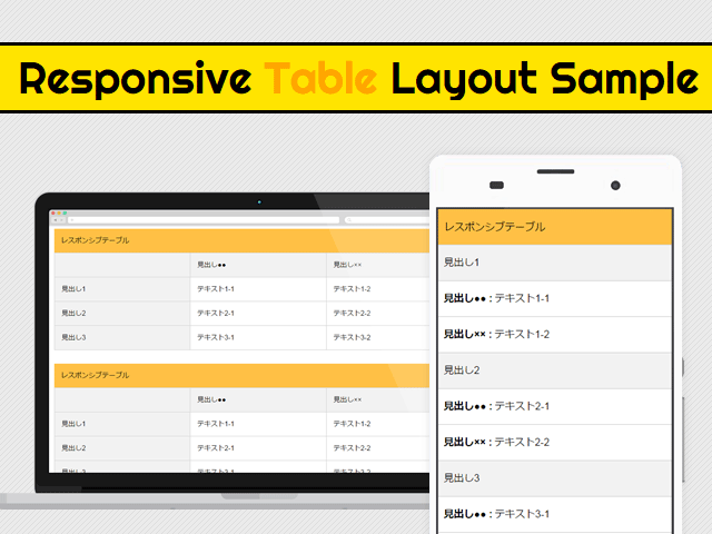
CSSとjQueryを使ったtableをレスポンシブデザインに対応させる6パターン
このブログをマテリアルデザインっぽくリニューアルしたときに、デザイン以外にも機能面で強化しているところを紹介していきたいと思います。第一弾はレスポンシブデザインにおけるテーブルの可変パターンです。
レスポンシブデザインで特に悩ましいのが表組み(テーブル)のレイアウトではないでしょうか。スマートフォンやタブレットで見た時に横幅が狭くて見づらいサイトになっていませんか?
今回はそんな方のためにサンプルを6パターン用意してみました。サイトに合わせてお好きなパターンをご使用下さい。
※本ページは広告・アフィリエイトプログラムにより収益を得ています。
デモ・ソースコード
まずはサンプルをご覧ください。
右上の  を押すと別窓で表示されます。
See the Pen Responsive Table by tokumewi (@tokumewi) on CodePen.
続いて基本のソースコードです。これをベースとしてカスタマイズしていきます。
HTML
<div id="wrap">

  <div class="tableBlock patternXX">
  <table>
    <caption>レスポンシブテーブル</caption>
    <tbody>
    <tr>
      <th>見出し1</th>
      <td>テキスト1-1</td>
      <td>テキスト1-2</td>
    </tr>
    <tr>
      <th>見出し2</th>
      <td>テキスト2-1</td>
      <td>テキスト2-2</td>
    </tr>
    <tr>
      <th>見出し3</th>
      <td>テキスト3-1</td>
      <td>テキスト3-2</td>
    </tr>
    </tbody>
  </table>
  <!-- /.tableBlock --></div>

<!-- /#wrap --></div>
CSS
.tableBlock {
  margin-top:2em;
}
table {
  width:100%;
  table-layout:fixed;
  -webkit-box-sizing:border-box;
  box-sizing:border-box;
  border:1px solid #cfcfcf;
}
table caption {
  padding:1em;
  line-height: 1.5;
  text-align: left;
  background:#ffc045;
}
table tr th {
  background:#f2f2f2;
}
table tr th,
table tr td {
  padding:1em;
  line-height: 1.5;
  text-align:left;
  border:1px solid #cfcfcf;
}
解説
一気に全部書かれたら何のことだか良くわからないと思うので、1つずつ解説していきます。
パターン1:単純に幅可変
See the Pen Responsive Table pattern01 by tokumewi (@tokumewi) on CodePen.
特に何か特殊なことをするわけでもなく、幅を縮小させるだけのレイアウトです。セル内の文字が多くなると読みづらくなってしまいます。基本ソースから何も変わりません。
パターン2:フォントサイズ縮小
See the Pen Responsive Table pattern02 by tokumewi (@tokumewi) on CodePen.
ウィンドウ幅が縮まるとフォントサイズを小さくする方法。PCと同じ情報量にはなるものの、文字サイズが小さすぎて読みづらくなるデメリットがあります。ユーザーに拡大させるならこっちの手法でいいかも。
CSS
/* Tablet */
@media screen and (max-width:768px){

  /* パターン2:フォントサイズ縮小 */
  .tableBlock.pattern02 table {
    font-size:75%;
  }

/* Tablet */ }

/* SmartPhone */
@media screen and (max-width:480px){

  /* パターン2:フォントサイズ縮小 */
  .tableBlock.pattern02 table {
    font-size:50%;
  }

/* Smartphone */ }
パターン3:縦並び
See the Pen Responsive Table pattern03 by tokumewi (@tokumewi) on CodePen.
テーブルのセル全てをを縦に並べる方法。横幅が狭くならないので読みやすくなるが、料金表などの行列それぞれに見出しがある表には向いていません。
まずはテーブルのあらゆる要素をdisplay:block;でブロック要素にして縦並びにします。これだけだとテーブルに付けている線が二重に表示されてしまいます。
table要素であれば基本ソースに書いてあるborder-collapse:collapse;で二重になった線を重ねられますが、ブロック要素には効きません。そこで、thとtdに対してmargin:-1px;を指定することで線を重ねています。
CSS
/* Tablet */
@media screen and (max-width:768px){

  /* パターン3:テーブルセルを縦並びに */
  .tableBlock.pattern03 table,
  .tableBlock.pattern03 table caption,
  .tableBlock.pattern03 table thead,
  .tableBlock.pattern03 table tbody,
  .tableBlock.pattern03 table tr,
  .tableBlock.pattern03 table tr th,
  .tableBlock.pattern03 table tr td {
    display:block;
  }
  .tableBlock.pattern03 table tr th,
  .tableBlock.pattern03 table tr td {
    margin:-1px; /* borderが二重になるのを防ぐ */
  }

/* Tablet */ }
パターン4:横スクロール
See the Pen Responsive Table pattern04 by tokumewi (@tokumewi) on CodePen.
テーブルを幅固定にして親要素にoverflow-x:auto;を指定することで、固定幅以下になると横スクロールバーが発生してスクロール出来るようになります。
スマートフォンなどではスクロールしないとスクロールバーが出てこないので、スクロール出来ることに気づかないかもしれません。そのためにスクロールバーのデザインを変えて常時表示させるように調整しています。
CSS
/* パターン4:テーブルを横スクロールに */
.tableBlock.pattern04 {
  overflow-x:auto;
}
.tableBlock.pattern04 table {
  width:960px;
}
/* スクロールバー全体 */
.tableBlock.pattern04::-webkit-scrollbar{
    height: 0.5em;
    background-color: #F1F1F1;
}
/* スクロールバーのつまみ(可動部分) */
.tableBlock.pattern04::-webkit-scrollbar-thumb{
    background-color: #BCBCBC;
    border-radius: 12px;
    border-radius: 1.2rem;
}
.tableBlock.pattern04::-webkit-scrollbar-thumb:hover{
    background-color: #A9A9AA;
}
パターン5:リスト化
See the Pen Responsive Table pattern05 by tokumewi (@tokumewi) on CodePen.
tdのセルをdisplay:list-item;でリスト形式にすることで項目が一覧化されて読みやすくなります。
CSS
/* Tablet */
@media screen and (max-width:768px){

  /* パターン5:リスト化 */
  .tableBlock.pattern05 table,
  .tableBlock.pattern05 table caption,
  .tableBlock.pattern05 table thead,
  .tableBlock.pattern05 table tbody,
  .tableBlock.pattern05 table tr,
  .tableBlock.pattern05 table tr th {
    display:block;
  }
  .tableBlock.pattern05 table tr th {
    margin:-1px; /* borderが二重になるのを防ぐ */
  }
  .tableBlock.pattern05 table tr td {
    display:list-item;
    list-style:disc inside;
    border:none;
  }
  .tableBlock.pattern05 table tr td + td {
    padding-top:0;
  }

/* Tablet */ }
パターン6:thead縦横切替
See the Pen Responsive Table pattern06 by tokumewi (@tokumewi) on CodePen.
縦に並べるのが1番ベストな方法だと思っていましたが、行列それぞれに見出しがある時はどの見出しがどの項目のことを指しているのかが分からなくなってしまいます。
そこで考えたのがjQueryを使って見出し要素をテーブルのセル内にブチ込む方法です。jQueryでthead内のtd要素のテキストを取得し、data-thに値を追加します。
追加したテキストは擬似要素の:beforeに対して、content: attr(data-th) を指定するとdata-thのテキストを挿入する事が可能です。
HTML
<div class="tableBlock pattern06">
<table>
  <caption>レスポンシブテーブル パターン6:thead縦横切替</caption>
  <thead>
    <tr>
      <th></th>
      <th>見出し●●</th>
      <th>見出し××</th>
    </tr>
  </thead>
  <tbody>
  <tr>
    <th>見出し1</th>
    <td>テキスト1-1</td>
    <td>テキスト1-2</td>
  </tr>
  <tr>
    <th>見出し2</th>
    <td>テキスト2-1</td>
    <td>テキスト2-2</td>
  </tr>
  <tr>
    <th>見出し3</th>
    <td>テキスト3-1</td>
    <td>テキスト3-2</td>
  </tr>
  </tbody>
</table>
<!-- /.tableBlock pattern06 --></div>
CSS
/* Tablet */
@media screen and (max-width:768px){

  /* パターン6:縦横切替 */
  .tableBlock.pattern06 table,
  .tableBlock.pattern06 table caption,
  .tableBlock.pattern06 table thead,
  .tableBlock.pattern06 table tbody,
  .tableBlock.pattern06 table tr,
  .tableBlock.pattern06 table tr th,
  .tableBlock.pattern06 table tr td {
    display:block;
  }
  .tableBlock.pattern06 table tr th,
  .tableBlock.pattern06 table tr td {
    margin:-1px; /* borderが二重になるのを防ぐ */
  }
  .tableBlock.pattern06 table thead {
	  display:none;
  }
  .tableBlock.pattern06 table tbody tr td[data-th]:before {
    content: attr(data-th) " : ";
    font-weight: bold;
  	display: inline-block;
    margin-right:0.25em;
  }

/* Tablet */ }
jQuery
$(function(){
	// パターン6:縦横切替のテーブルにdata属性を追加
	function tableData(){
		var index ='';
		var headTxt ='';
		$('.tableBlock.pattern06 table').each(function() {
			$('thead tr th').each(function() {

				// theadの位置やテキストを取得
				index = $(this).index()-1;
				headTxt = $(this).text();

				// tbodyのセルにdata属性を追加
				$('tbody tr').each(function() {
					$(this).find('td').eq(index).attr('data-th',headTxt);
				});
			});
		});
	}
  tableData();
});
2015/09/26追記:上記jsでは複数テーブルを使用すると全て同じテキストになってしまうので、以下のコードをご使用下さい。申し訳ございません。
$(function(){
	// パターン6:縦横切替のテーブルにdata属性を追加
	function tableData(){
		var index ='';
		var headTxt ='';
		$('.tableBlock02 table').each(function() {
			$(this).find('thead tr th').each(function() {

				// theadの位置やテキストを取得
				index = $(this).index()-1;
				headTxt = $(this).text();
				console.log(headTxt)

				// tbodyのセルにdata属性を追加
				$(this).parents('table').find('tbody tr').each(function() {
				$(this).find('td').eq(index).attr('data-th',headTxt);
			});
		});
	});
	tableData();
});
まとめ
複雑な表になる場合は、表を画像化したり表自体を小さくしてユーザーに拡大してもらうなどの対応が必要になってくるかもれしれません。
今回の例ではrowspanとcolspanなどを考慮していないため、複雑な表組みには対応していません。
上記のjQueryコードにif文で「thまたはtdにrowspanまたはcolspanが付いていたらクローンを作って挿入する」みたいなことが出来たら対応できるかもしれません。時間があれば試してみます。
jQueryプラグインなどを使えばもっと簡単に対応できるので、手っ取り早く対応したいときはこちらもオススメです。


